
Appearance
Customize the same interface in Blueprint
Follow these steps to change appearance, layout and data without editing plugin C++. Click any real editor/runtime image to enlarge it; Actual size · 100% preserves readable editor text with scrolling. Gameplay stays in your game's adapter.
1. Duplicate a theme into your project
Enable Show Plugin Content in the Content Browser. Open /InterfaceForge/UIForge/Themes/DA_ForgeEmber, then duplicate it into your game's Content folder before customizing. DA_ForgeMoonsteel is the cool alternative.
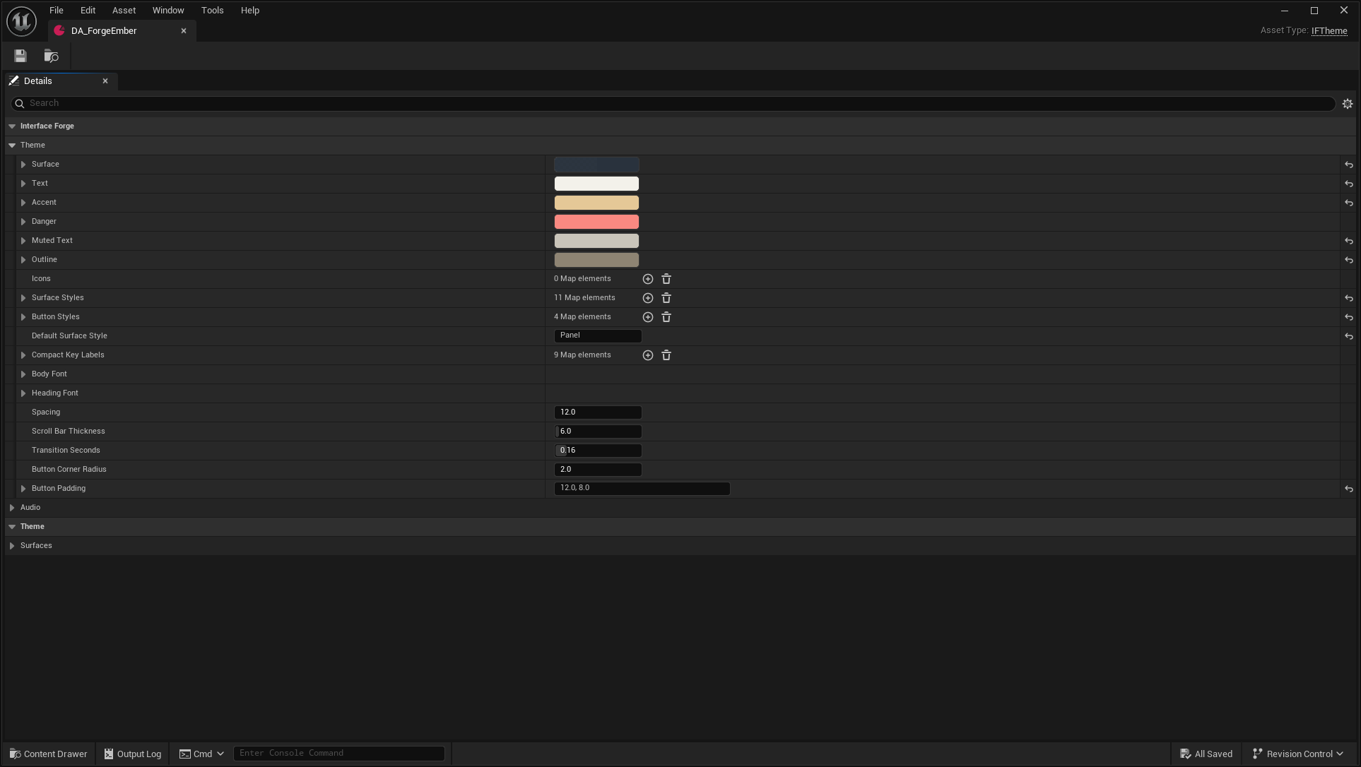
Author Body Font, semantic colors, spacing, sounds, transitions, Button Styles and Surface Styles. Call Set Theme on IFLocalPlayerSubsystem before Create Root. Use Theme Override for a local widget variation.
Expected: multiple screens share one material/type/color family; changing a theme does not copy their widget trees or gameplay rules.
2. Style buttons as one family
Under Button Styles, author Standard, Primary, Quiet, Destructive. Each Button Skin contains Normal, Emphasized, Pressed, Selected and Unavailable brushes, text colors and Feedback Seconds. Texture/material brushes use normal Slate nine-slice margins.
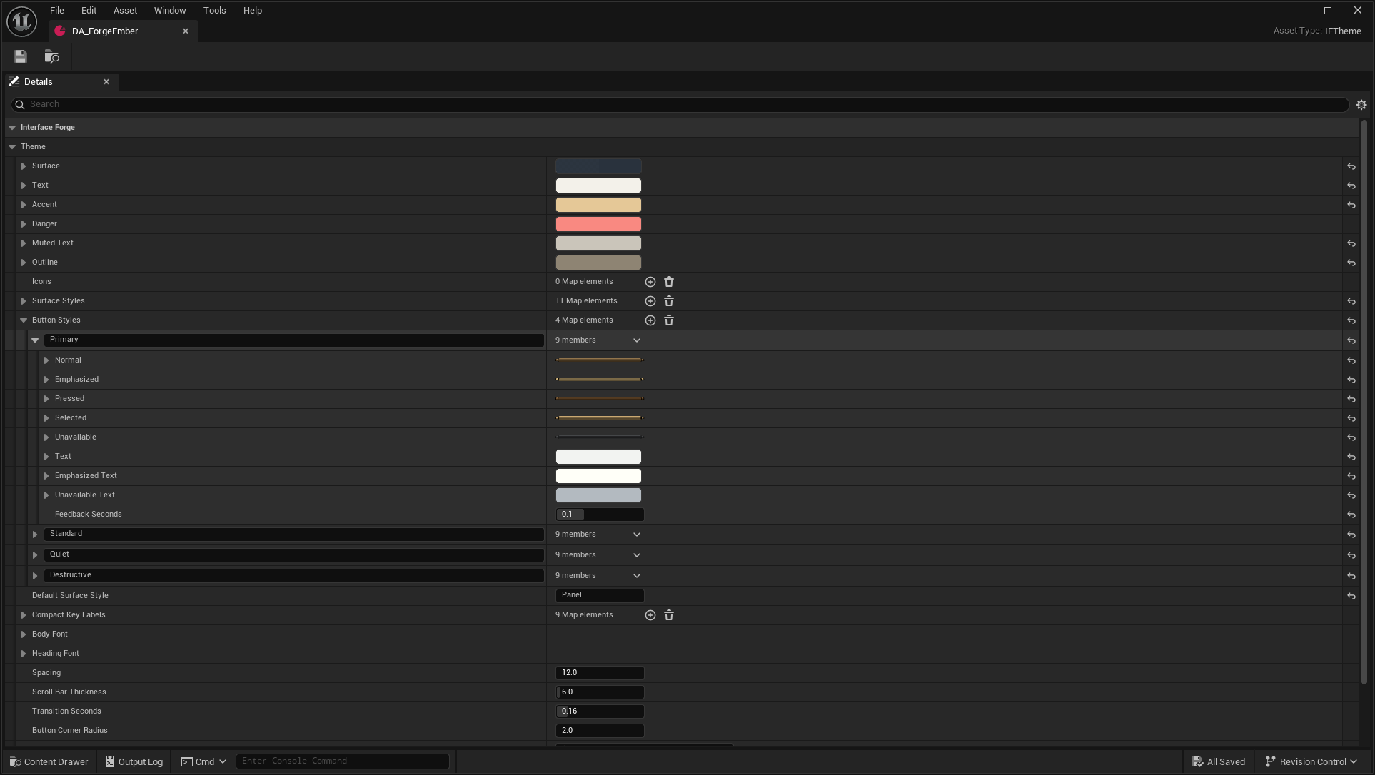
On IFButton/IFCommandButton set Button Role, or use Skin Name for another key. For live edits use Set Button Role, or set Skin Name then Refresh Appearance. Missing keys retain the semantic fallback.
For a custom tree, derive a Widget Blueprint from IFButton; use IFCommandButton when you need data-source action routing. Optional FocusBorder, LabelWidget, AvailabilityWidget and TooltipAnchor names participate in built-in presentation. Alternatively drive your tree with On Appearance Updated and On Visual State Changed.
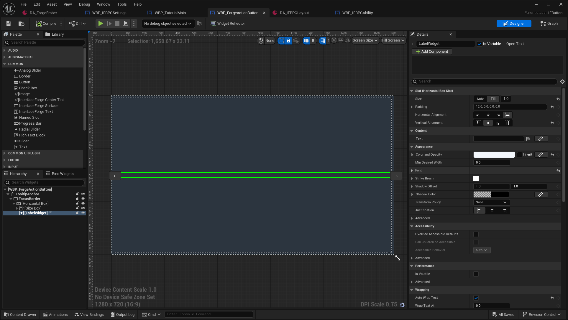
LabelWidget is selected inside TooltipAnchor → FocusBorder → Horizontal Box. This reusable template receives its label from IFButton; the empty template text is not a finished game button preview.
Expected: your art changes while click behavior, CommonUI focus and tooltip contracts remain usable. Keep decoration hit-test invisible. Native labels preview in Designer; Blueprint-owned trees retain their own slot alignment. The built-in finite tint/text feedback honors Reduced Motion. Your own UMG animation should check Get Presented Preferences → Reduced Motion too. See the exact styling contracts.
3. Replace a HUD region
Open /Game/ForgeExamples/UI/RPG/DA_IFRPGLayout. Expand Layout → Regions → Index[0]. Its named regions define anchors, alignment, offsets, dimensions, automatic sizing, ordering and compact-layout visibility.
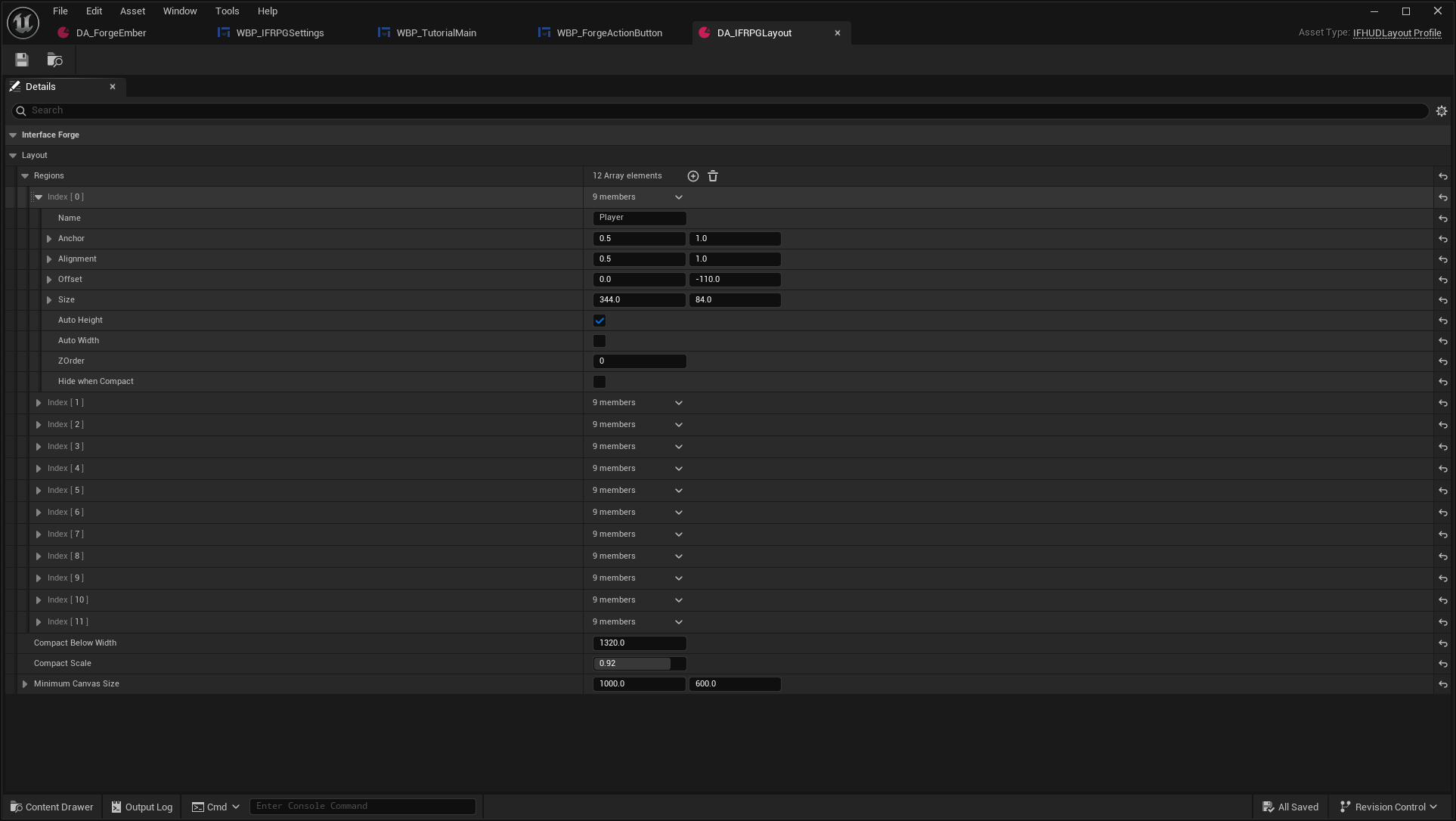
Create an IFHUDLayout Blueprint with your profile, then use Set Region Widget to assign a widget to a region name. Widget creation/data binding belongs to your Blueprint; the profile controls placement. Connect the replacement to the existing model or your own interface-provided data.
Expected: a different party frame, action control or context panel can occupy that region without a new data backend. Test long labels and enlarged text; uniformly increasing every size is not a complete responsive design. See responsive layouts and HUD authoring.
4. Customize an icon and its cooldown
Open /Game/ForgeExamples/UI/RPG/WBP_IFRPGAbility and select CooldownTint. Its ordinary Designer tree contains the command hit target, icon, tint, countdown and remapping-aware ActionPrompt.
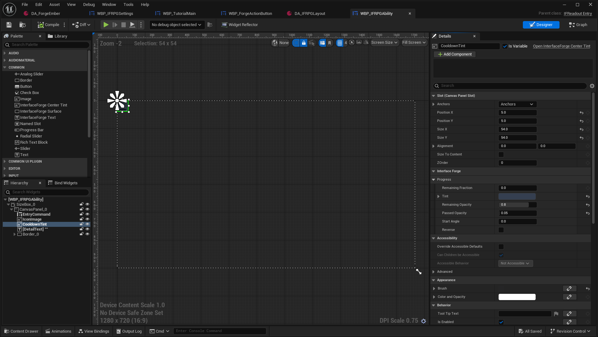
Expand Interface Forge → Progress in Details. The entry's icon/data are assigned at runtime; this view teaches the tint properties and its layering over IconImage.
IFCenterTint provides the independently authored center-origin interior tint based on the inspected Sakura behavior. Tint and remaining/passed opacity are presentation properties; the example supplies its normalized recovery fraction through the entry. Keep the key prompt inside the icon so it cannot cut through the outer frame.
Supply your own icon texture, colors and countdown styling. For other presentations, IFProgressWidget exposes Linear, Radial, Square Perimeter, Segmented and Charges. These are separate choices, not substitutes for the center-origin tint.
Expected: one recovery value can drive another visual without ability rules moving into the UI backend. The center-tint guide documents actual parameters/direction, and progress recipes cover the other styles.
5. Switch the theme live
Call Set Theme on the same local-player subsystem with your replacement IFTheme. These two actual captures use the same window, data and actions.
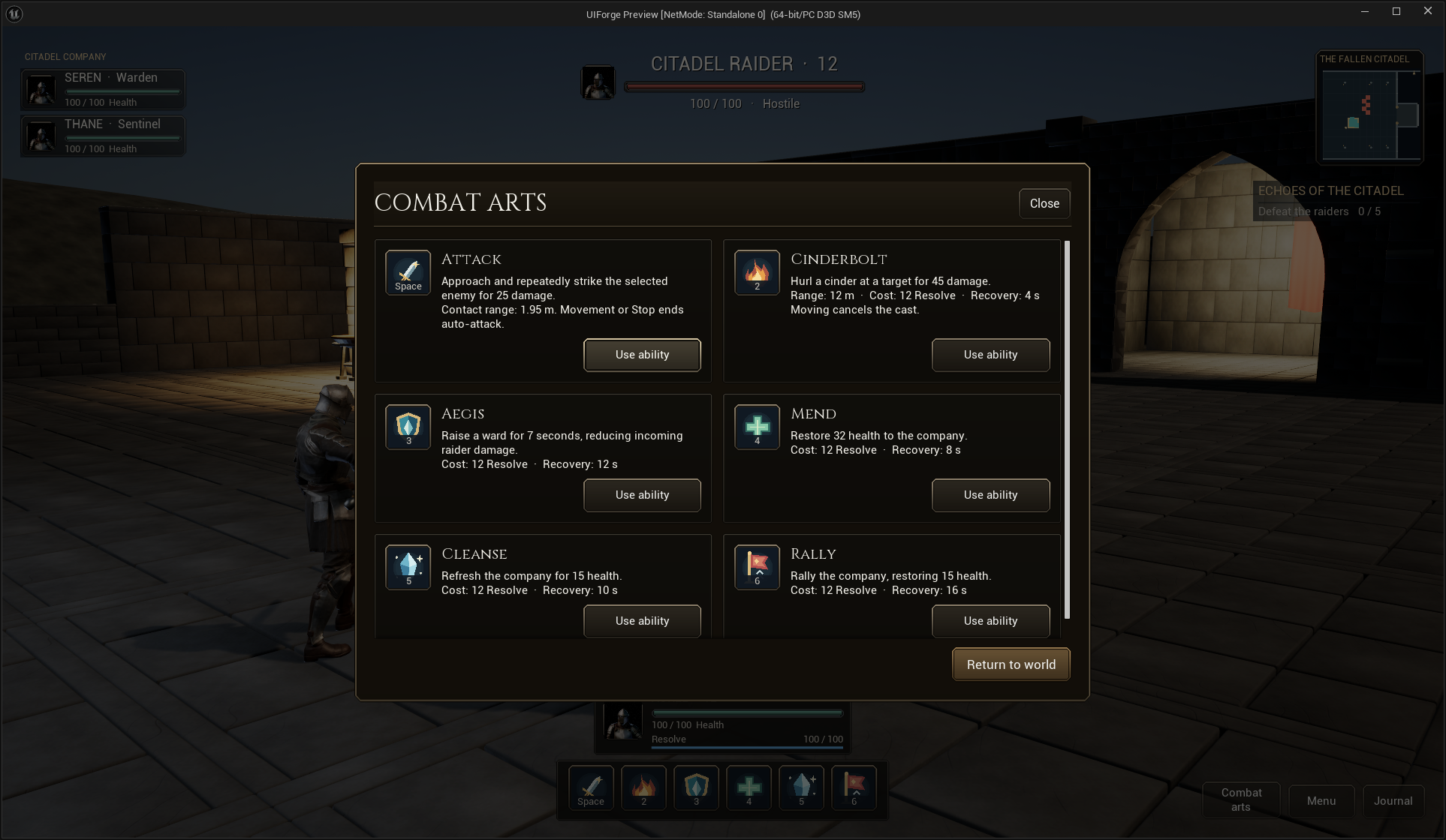
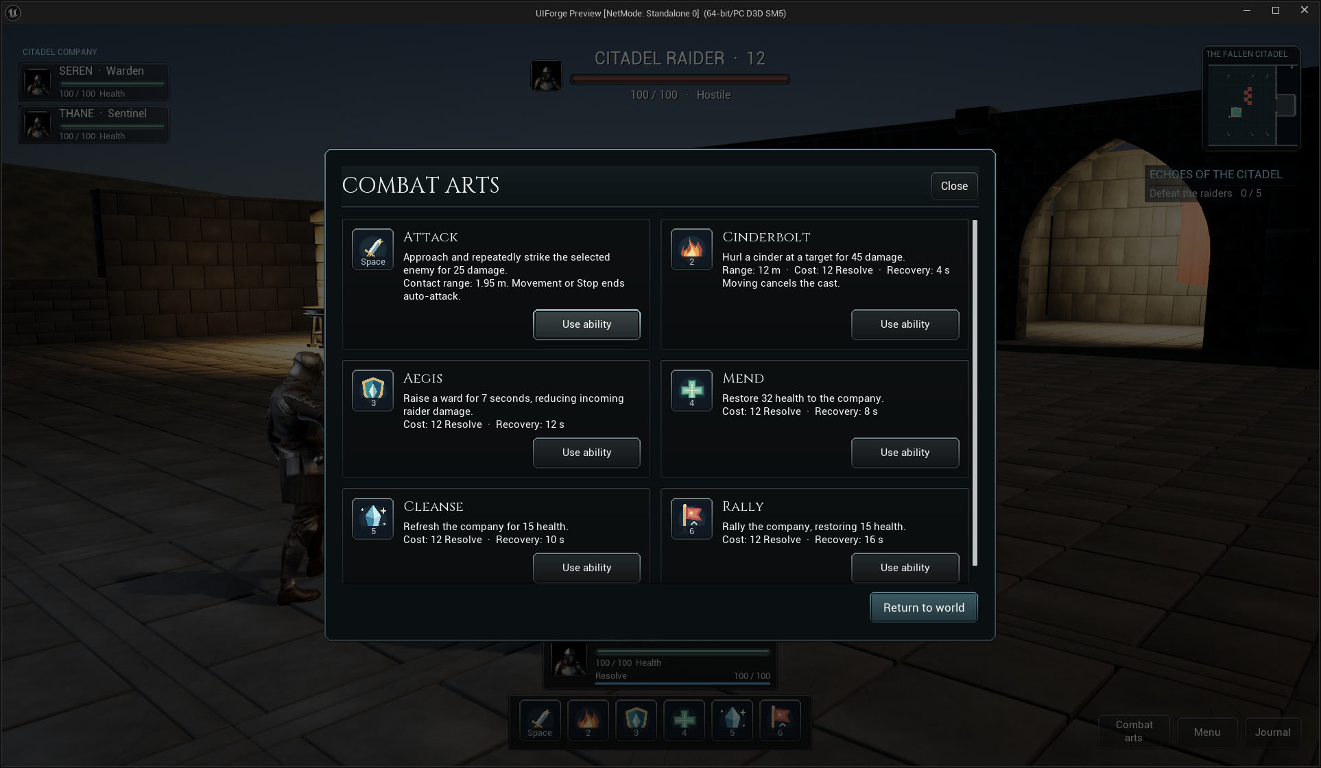
Expected: named button/surface roles and text update together. Replace a Widget Blueprint class to change layout; supply another IFDataSource implementation to change the information.
6. Create your own entry
Use the visual integration recipe to inspect the saved screen/entry graphs. Initialize stable data/context, update from notifications, route validated actions to the source, and release subscriptions on removal/recycling.
Item cards, quests and entity cards are presentation. InterfaceForge does not implement inventory storage, equipment, crafting or replication. MassForge integration stays in an optional adapter; the core works independently.