
Appearance
Progress presentation in Blueprint
Use Forge Progress for ordinary linear tracks, radial outlines, square/rectangular perimeter outlines, segmented fills and whole charge cells. These are procedural UI styles. Sakura's requested cooldown uses the separate InterfaceForge Center Tint above its icon; keep that center-origin tint and its layering when reproducing that presentation.
Bind game-owned progress
Add Forge Progress to your widget, choose Style, Desired Size, Thickness, Segments, Reverse, Start Offset and theme options in the Designer. On your provider's changed event, call Set Fraction with a normalized0–1 value. The convenience IFEntryWidget already wires Notify Data Changed → On Entry Refreshed. A manual Set Fraction stops any previous UI-owned cooldown on this widget. For a decorative overlay above a clickable sibling, set its visibility to Not Hit-Testable (Self & All Children) (HitTestInvisible) so it cannot cover that sibling's input target.
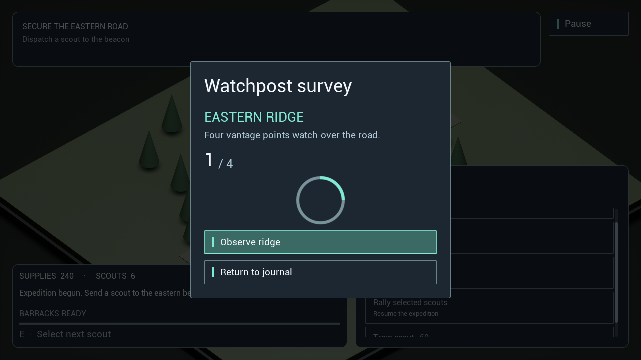
The default RTS/RPG readouts use real provider-driven linear tracks. Pause → Field journal → Watchpost survey opens a Blueprint-only provider and custom entry. Observe ridge advances one of four observations; its count, fraction, availability and completed prose change through the same saved public graphs.
Customize the same saved entry
Open WBP_WatchpostEntry under /Game/UI/Blueprint. Set its Progress Presentation property in Watchpost | Presentation to Linear, Radial, Square Perimeter, Segmented or Charges. Pre Construct applies this property, including Designer previews. In this entry, use that property instead of changing only RecordProgress's Style; Pre Construct intentionally reapplies the entry's configured presentation.
Call Apply Progress Presentation on a live entry to change styles. This is an editable Blueprint custom event supplied by the example, using public plugin/engine nodes:
flowchart LR
    A[Apply Progress Presentation: Presentation Style] --> S[Set Progress Presentation]
    S --> B{Radial or Square Perimeter?}
    B -->|Yes| D[Configure Progress: 96x96 / 4 segments]
    B -->|No| L[Configure Progress: 440x8 / 4 segments]
    D --> C[Cast RecordProgress Slot to VerticalBoxSlot / Set Horizontal Alignment: Center]
    L --> F[Set Horizontal Alignment: Fill]
    E[Pre Construct] -->|Progress Presentation| A
Its On Entry Refreshed → Set Fraction and observation button graph are unchanged. The same source/model supports every style; no new subclass or gameplay implementation is needed. The helper also prevents a Vertical Box's fill alignment from stretching a96×96 dial. In your own layout, use the appropriate slot/alignment or Size Box.
Actual source interaction after one observation (UE5.6.1,1280×720):
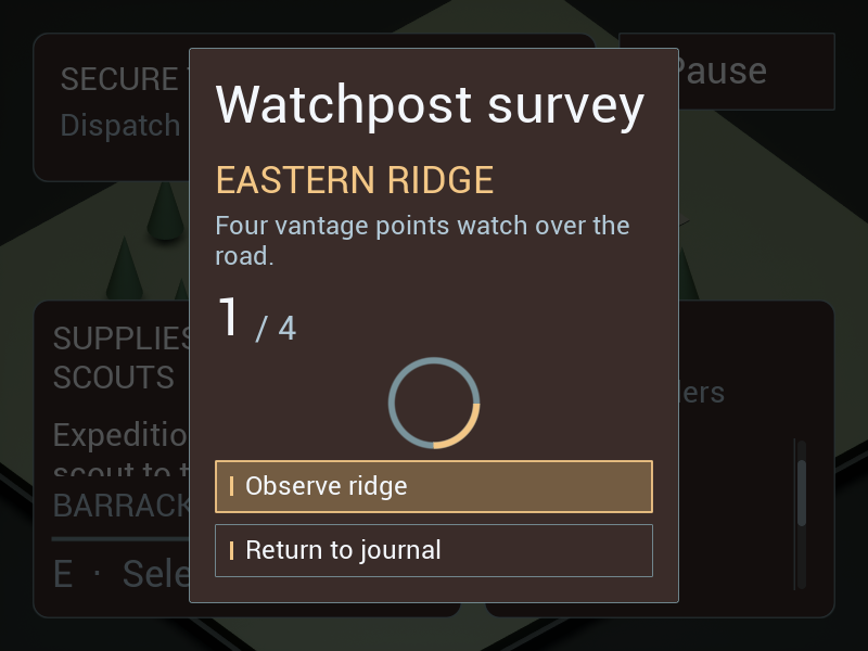
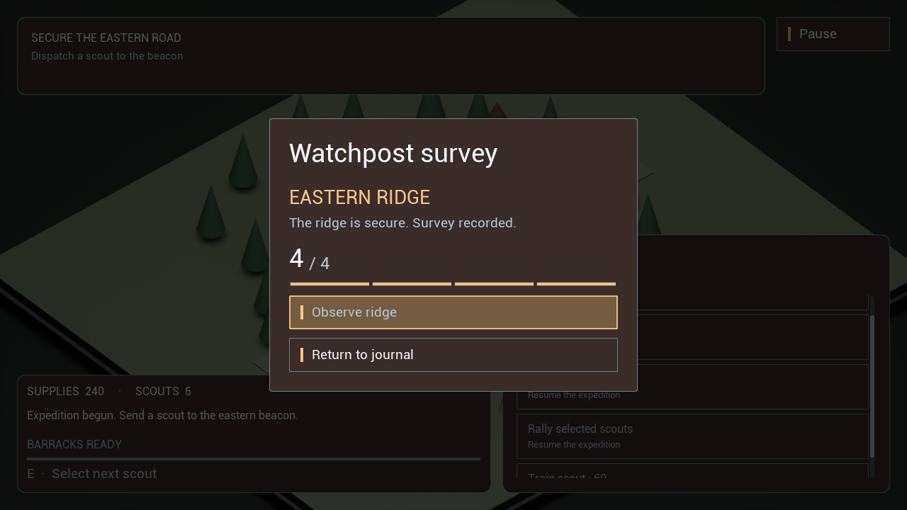
The same entry at enlarged UI/text scale with a reversed outline and another origin (UE5.8.3 source), and completed charge cells (UE5.7.4 Development package), are in enlarged reverse and completed survey. These are original game interfaces; simulated input produced the recorded interactions.
Public runtime controls
| Node / property | Result |
|---|---|
| Configure Progress | Sets style, desired size, segment capacity, direction and origin; invalid style, nonpositive/nonfinite size or nonfinite origin returns false and preserves the previous configuration. Valid segment counts clamp1–64 and origin clamps0–1. It invalidates layout/paint and preserves the current reading/clock. |
| Set Fraction | Finite values clamp0–1; nonfinite values display0. Stops a previous local clock. |
| Get Displayed Fraction | The actual manual or current timed reading. |
| Get Displayed Charges | Whole filled cells, quantized down using Segments as capacity. A tiny1e-5 cell-unit tolerance prevents floating-point count underruns. It owns no charges, item state or action rules. |
| Reverse | Fills from the right for line/cell styles, counterclockwise for radial/perimeter styles. |
| Start Offset | Turns/perimeter fraction: radial0 starts at the top; square0 at top-left. Only outline styles use this origin. |
| Use Theme Colors / Theme Override → Refresh Appearance | Follows Accent/Outline or a local theme; disable theme colors to retain your explicit Fill/Track colors. |
For a charge display with three filled cells out of five, set Style=Charges and Segments=5, then Set Fraction to3÷5. The renderer and Get Displayed Charges return three whole cells, including normalized fractions that land a few floating-point units below an integer. A partly filled charge does not become a whole cell. Validate action availability and actual charges in your gameplay provider.
Timed UI presentation and countdown text
Start Cooldown(Duration Seconds) starts at1 and decreases to0 against an absolute game-time endpoint. Game-world pause freezes it; changing presentation does not restart it. Zero/negative/nonfinite duration completes immediately. Clear Cooldown clears its reading. Get Remaining Seconds → Ceil → To Text (Integer) → Set Text supplies a countdown label through your existing shared UI update path. Hide the label/tint when the remaining value reaches0.
Use this clock for a small transient UI timer when the widget owns its timing. For gameplay cooldowns, use the game's authoritative time/data and notify entries: rebuilding a UI widget must not restart an ability. The RPG example demonstrates provider-driven fraction/countdown fields; its center tint never starts a gameplay timer. Avoid independent per-widget population scans or creating one timer for every recycled list entry.
Current verification passes60source/exact Development-package progress runs acrossUE5.6.1/5.7.4/5.8.3, plus24shared RTS/RPG flow regressions and12real Ward/tint/world-entry regressions. All30saved BPs compile cleanly on each engine, and revised core builds/loads independently. Runtime record gives commands, hashes and limits. Physical controller testing remains deferred. The player-facing survey contains no instructional style selector or test-only timer controls; this scoped milestone is not whole-product release acceptance.