Appearance
Author button and resource artwork in Blueprint
Customize with the illustrated Blueprint guide: exact locations, real Designer/graph images and expected results. This page supplies the detailed contract/reference.
Development revision, 2026-10-27. These public appearance features are implemented in the competitive quality pass. They do not certify that every example window has finished its visual review.
Named button skins
Open a Forge Theme data asset. In Button Styles, add the keys Standard, Primary, Quiet and Destructive. Each value is a Button Skin structure. Set its Normal, Emphasized, Pressed, Selected and Unavailable brushes, text colors and Feedback Seconds. Brushes accept your textures/materials and ordinary Slate nine-slice margins. The skin's tint is the state color; use a neutral image when you want one asset to support multiple palettes. The example's original editable sources are in ContentSource/UI/Emberglass.
On a Forge Button / IFButton or IFCommandButton choose Button Role. Its role automatically resolves the matching theme key. Alternatively set Skin Name to any other key you authored. Set Theme Override to restyle one control. Missing keys use the original semantic button appearance, so existing projects need no migration.
For a live Blueprint change, use Set Button Role, or set Skin Name and call Refresh Appearance. Expected result: the same action, CommonUI navigation and tooltip contract remains active while the art changes. Use Set Action Availability with a reason to block an action without removing navigation focus.
State priority is unavailable → pressed → hover/navigation focus → selected → normal. Pointer hover does not compete with controller/keyboard focus. Get Visual State reads the resolved state. Implement On Visual State Changed in your button Blueprint to animate a custom decoration. Use On Appearance Updated for the theme, input method, navigation focus, pointer hover and enabled information.
To create your own tree, make a Widget Blueprint derived from IFCommandButton. Add a Border named FocusBorder, a Text Block named LabelWidget, and optionally AvailabilityWidget and TooltipAnchor. Those names opt into the built-in presentation. You may omit them and use the appearance events to drive your own tree. Keep ornamental images hit-test invisible. No plugin source edit or per-variation C++ subclass is needed.
The built-in feedback interpolates tint/text using a short ease-out. Brush resources/geometry switch immediately; this is not cross-fading arbitrary materials. It never translates or resizes the hit target. Repeated state changes resume from the current displayed color. Feedback stops when settled and is removed when the widget is destructed. Reduced Motion in the same settings transaction snaps changes. If your Blueprint adds its own animation, honor Get Presented Preferences → Reduced Motion as well.
Resource bars using your own art
Place Forge Progress in your Widget Blueprint. Choose Style = Linear, set a useful Desired Size, then enable Use Linear Brushes. Set Linear Fill Brush and Linear Track Brush. Supply a neutral fill to tint through Fill Color; Track Color multiplies the track art. White retains the artwork's original color. Texture alpha is supported.
For project-wide changes, add two keys to the theme's Surface Styles, then select those in Linear Fill Style and Linear Track Style. Leave the keys empty to use local brushes. Switching to a theme without a key falls back to the local brush rather than retaining art from the previous theme.
At runtime call Set Linear Brushes to replace local art and clear the two style keys. This enables brush rendering; Style must still be Linear. Configure Progress can select Linear, desired size and reverse direction without replacing the widget. Call Set Fraction with a normalized value. Expected results:
| Fraction / direction | Result |
|---|---|
| 0 | Track only |
| 0.5 / normal | Left half of full-sized fill artwork |
| 0.5 / reverse | Right half of full-sized fill artwork |
| 1 | Entire fill |
The fill is drawn at its full geometry and clipped. End caps/highlights do not squeeze as health falls. Nine-slice margins preserve outer details across sizes; the fill boundary clips the image and does not invent a new end-cap at every fraction. Idle values invalidate on change instead of requiring Blueprint Tick. Engine DPI and widget transforms apply normally.
For automatic model binding, keep the control name FractionBar inside an IFReadoutEntry. It receives Presentation Data → Set Fraction updates through the normal entry contract. Your gameplay code owns health and authority; this control displays a value.
This art path applies only to Linear. Radial, segmented, charges and square-perimeter modes retain their procedural renderer. IFCenterTint and Sakura's reproduced center-origin cooldown material remain independent and unchanged. Do not replace an icon cooldown with a resource-bar skin.
Shared themes and window headers
The standalone core assets /InterfaceForge/UIForge/Themes/DA_ForgeEmber and DA_ForgeMoonsteel provide warm and cool palettes using the same small neutral art resources. Call Get Local Player Subsystem (IFLocalPlayerSubsystem) → Set Theme with either asset. No example game, character mesh or external font is required. The RPG's DA_IFEmberglass / DA_IFMoonsteel variants use the same core artwork with the example's licensed heading font. Editable originals and hashes are in Plugins/InterfaceForge/SourceAssets/UI.
Choose Window, Header, Inset, Row, Combat or Panel on an InterfaceForge Surface. These are names in Surface Styles, not special widget classes. A typical window is a Surface containing a Vertical Box: header Horizontal Box, flexible Scroll Box, then footer Horizontal Box. Put the heading on a Fill slot, a Close button on Auto, and set that IFCommandButton's Request Screen Back. Keep footer actions on Auto slots with a Fill spacer between secondary and primary actions. These layouts remain editable in the Widget Blueprint Designer.
On a theme, Dialog Surface Style = Window and Dialog Header Surface Style = Header opt the native confirmation into that family. Empty header style preserves the old text-only heading. Build an IFDialogData, set Title, Message, Confirm Label, Cancel Label, and call Push Dialog on the root. Destructive Action selects the Destructive button role; it does not authorize or execute gameplay. The dialog still returns exactly one result, focuses Cancel initially and supports Back. Your result handler owns the action.
InterfaceForge Key Selector and the standard setting-row choice control follow Button Styles → Standard. Removing that key restores their semantic rounded fallback. Set the setting row's Follow Theme Colors off to retain a fully custom Slider/Combo style. Custom option generators are preserved.
Compact settings composition
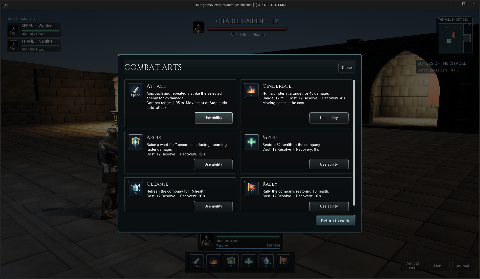
/Game/ForgeExamples/UI/RPG/WBP_IFRPGSettingRow is an ordinary Blueprint child of IFSettingRow, showing a different layout over the same definition/session contract. Its left column has LabelText / HelpText; the right has ValueText / ValueSlider / ValueToggleButton / ValueChoice. StatusText appears only when a reason is present. No fixed row height clips wrapped help or enlarged text. Copy this layout into your own Blueprint, set each instance's Definition, and place rows on the pages of an IFSettingsMenu. Built-in bindings and custom providers share Apply/Cancel/Defaults. See Blueprint settings composition for the complete transaction and integration recipe.
Choose a primary menu action in Blueprint
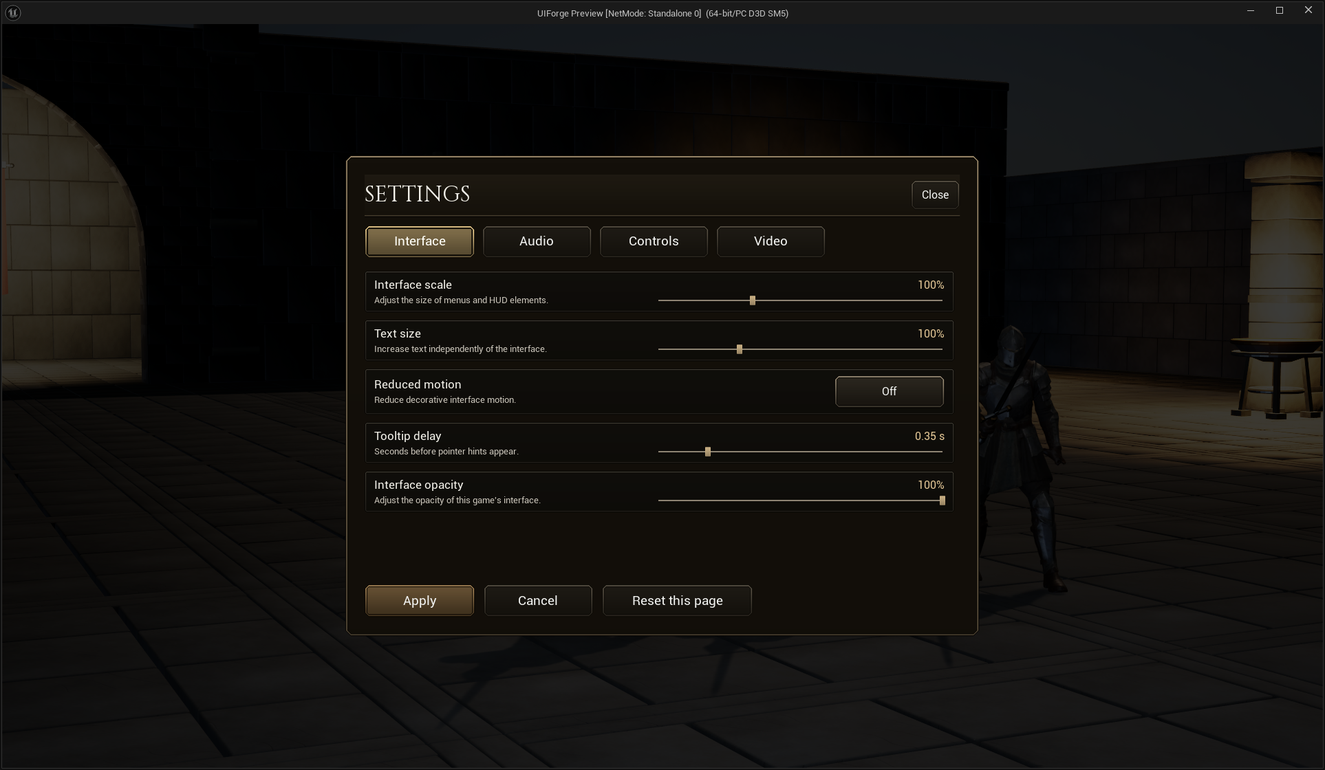
The RPG and RTS main menus implement Event Initialize Screen → Parent: Initialize Screen → Get UIModel (Continue) → Cast to IFPresentationData → Branch (Enabled). True calls Set Button Role (Primary) on Continue and Set Button Role (Quiet) on New. False assigns the reverse. The game adapter supplies save availability; the UI does not read or create save files. The existing Initial Focus Name = Choice0 / Fallback Focus Name = Choice1 chooses a usable navigation target. This graph reruns for each supplied screen context, including a pooled menu returning from gameplay.
The two branches are runtime-tested using temporary availability on the same stable model, restored within the test call; no save is removed to manufacture the no-save case.
Verification record
The first appearance runtime checks cover role skin resolution, unavailable/selected states, interrupted finite feedback, reduced motion, missing-key fallback and idle completion. Native main/confirmation views were visually inspected. Resource rendering now passes zero/half/reverse/full and local theme-key fallback, including actual captured pixel checks. Native standalone menu/confirmation/cast/damage/pause/settings also passes. Current13-check Blueprint composition/source proof, measured responsive/enlarged layouts, and27-observation native cooked-package interaction/restart pass are recorded in the active milestone ledger. No physical controller/touch claim is made.